MED-GOLD took part in a workshop that gathered together European projects from the Climateurope network to show the state of the art of climate service visualisations
The big challenge of a climate service is to communicate climate information to those in charge of making decisions based on this information, who are not always familiar with technical concepts. Visualisation of climate services becomes then a crucial issue to transfer knowledge in a user-friendly way, empowering stakeholders to make informed decisions regardless of their scientific knowledge.
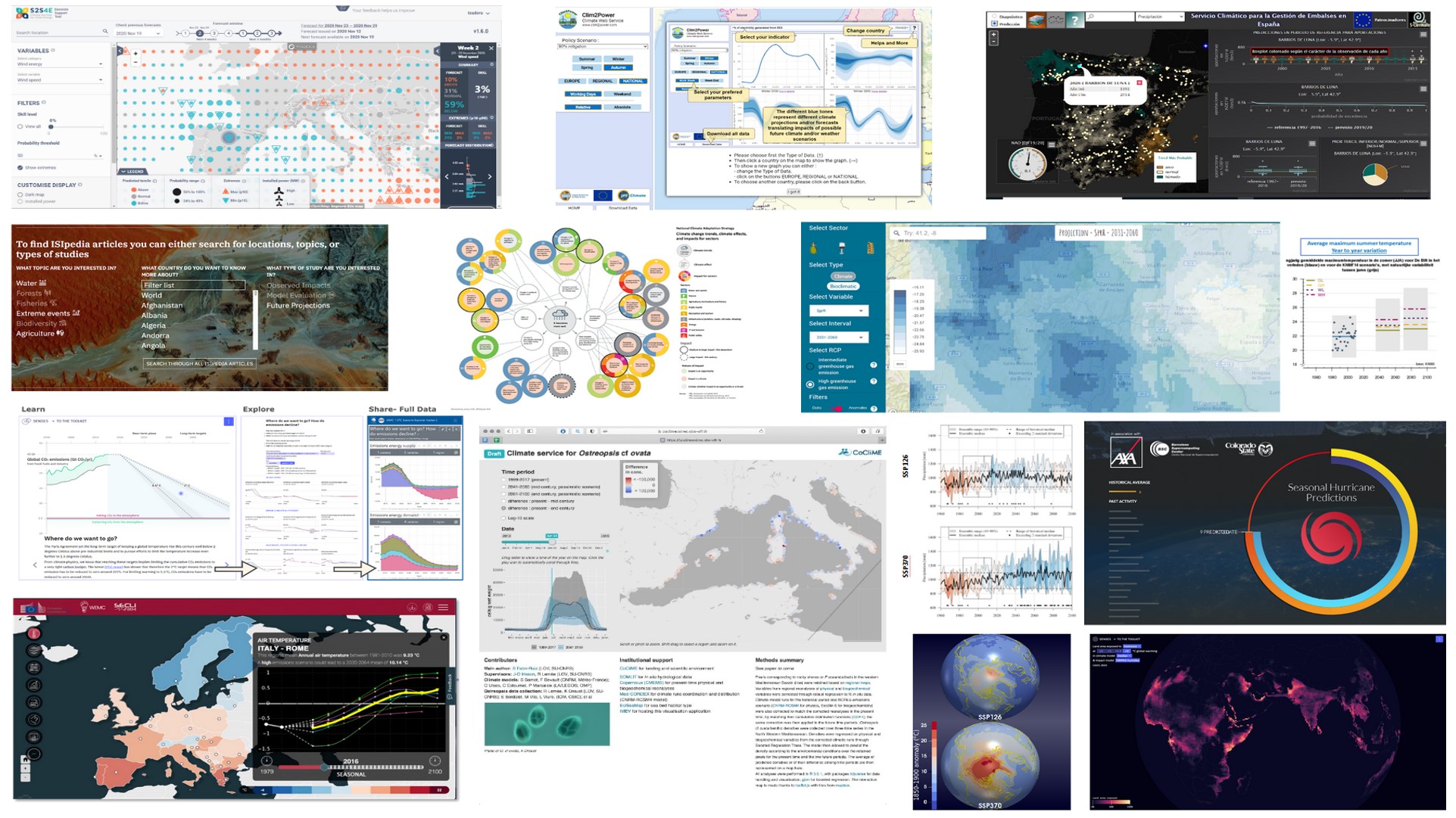
The different aspects of data visualisation were among the topics tackled in a dedicated workshop organised in the framework of the Climateurope initiative for projects from their climate services network. The final goal of the workshop was to have a synthesis of the state of the art of climate service visualisations and to compile the lessons learned to create a document with useful recommendations for the next generation of climate services.
After a preparatory meeting involving 25 participants from interested climate services projects, the workshop was held on 19 November 2020 during the 4th Climateurope webstival, being conducted by Isadora Jiménez and Marta Terrado from the Barcelona Supercomputing Center (BSC). The interactive presentation allowed the participants to have a live discussion on visualisation topics, sharing their personal views and professional experiences.
Most of the participants agreed with the importance of simplifying complex information to make it accessible and easy to understand for decision-makers and other stakeholders. To achieve this critical goal, the motto “a picture is worth a thousand words” prevailed among climate services providers over other formats like reports or long texts.
Communicating uncertainty and probabilities to stakeholders
Different ways of displaying climate information for different kinds of users were shown during the workshop, from weather forecasts to seasonal predictions, long-term climate projections or climate change scenarios. The main challenge of these climate service visualisations, according to participants’ feedback, was communicating uncertainty and probabilities to stakeholders. Showing interactive options, using scenarios, focusing on extreme events, or providing averages and ranges were among the possible options mentioned by climate service providers.
Skill, anomaly, percentile, uncertainty, or model are among the common technical terms used by climate experts. Choosing the right terminology for non-climate experts was another difficult task discussed during the event. There was a general consensus that terminology needs to be adapted to the users’ expertise in favour of understanding. In addition, using the local language of stakeholders to deliver climate services could be an advantage in some situations.
Keep it simple. That can be considered the main takeaway of the climate services visualisation workshop organised by Climateurope. Other key aspects to take into account were following a user-centred design (UCD) approach, dosing information, using storytelling and putting into practice a multidisciplinary approach involving climate scientists, designers, experts in user experience, social scientists and communication experts. Everything possible to try to find the perfect balance between scientific precision and general understanding.
The case of the MED-GOLD Dashboard
MED-GOLD was one of the EU-funded projects that took part in the webinar organized by Climateurope. The MED-GOLD Dashboard, a tool that provides information about past and future climate, including seasonal forecasts and long-term projections, was an illustrative example of an interactive service where users can visualize climate data in an understandable way.
The MED-GOLD Dashboard is an online tool for agriculture decision-makers, in particular for grape, olive and durum wheat crops. The service allows users to explore probabilistic predictions of essential climate variables, such as temperature and precipitation, as well as bioclimatic indicators and risk indices for the specific crops, for months and years ahead.
Challenges for the creation of the visualisation were how to communicate the complexity of future probabilistic forecasts and forecast uncertainty to decision-makers. To solve these challenges, the dashboard map interface makes use of color and subtractive filters, which facilitate visualisation and user experience.
A user-centered design process was essential in the development of the Dashboard. Multiple interactions with early-adopters were conducted to test the tool and identify potential aspects to improve in order to make it more intuitive and easy to use.
Further participation of MED-GOLD
The visualisation workshop was not the only contribution of the MED-GOLD project to the 4th Climateurope webstival. Antonio Graça from Sogrape Vinhos in Portugal, one of the user champions participating in the project, organised the activity ‘Bringing a message in a bottle’. In a very inspiring way, he presented insights from the wine sector and made parallels between wine and climate services.
Sogrape also participated in the Bell House ice-breaker organised during the webstival, an activity merging science and art with the objective of communicating climate through music. A short musical video was produced using Sogrape’s field datasets. In particular, weekly data on the use of water in one of their vineyards in the Upper Douro Valley was used to produce the piece of music. Do you want to know how water in a vineyard sounds? Play it!
Written by José L. Cánovas (Barcelona Supercomputing Center)